Modify Product Items on the Recommendation Pages
Introduction
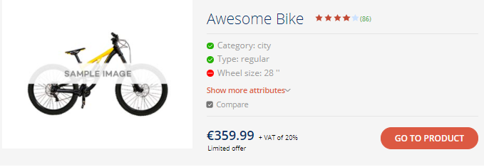
Every time the user is recommended a product, some of the product data is displayed. While the look of and layout of the data piece may vary, subject to the selected theme and other design settings. we'll call them "Product Tiles" for the convenience of further explanations. Such product overviews are displayed for all the products in the collection, recommended products, top products, and when products are being compared. You can tailor and customize the look of the Product Tiles using:
|  |
1. Appearance Settings of the Product Tiles
The appearance of the Product Tiles depends on the selected theme, color, and font of the Product Finder, as well as on the CSS settings. However, there is a number of dedicated settings:
Show product rating to let your customers know if other people have liked this product. Add complimentary text to the price, to explain it, emphasize how exclusive it is, etc. Add or remove buttons to add the product to the cart or open the Product details, and modify the behavior of the buttons. | 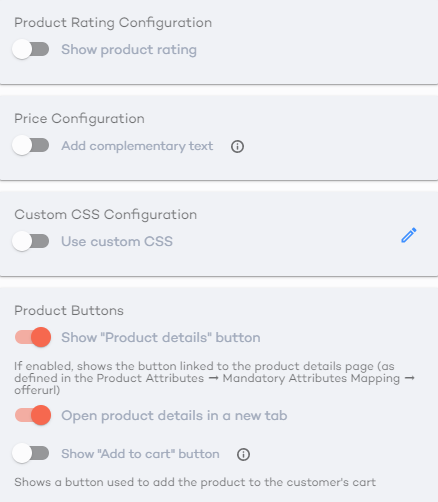 |
1.1 Display Product Rating
| Many stores collect feedback from their client or otherwise rate the product. If you've got rating data in your product collection, Product Finder 360 has got a great tool to display it in the product description. | 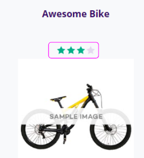 |
For Product Finder 360 to create this neat representation of the product rating you need to have some property that corresponds to the rating in your product catalog and:
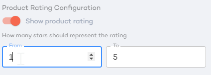
1. Turn on the "Product rating" slider. | 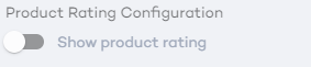 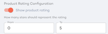 |
2. Define the rating range:
|  |
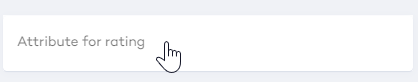
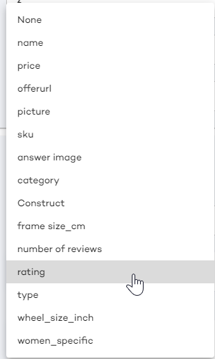
3. In the emerged window, define the product property that corresponds to the rating:
|  |
|  |
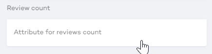
1.1.1 Display the Number of Reviews
If the product rating is based on the users' reviews, you can also add information on how many visitors have reviewed the product. If such information is available, there should be a field that represents it in the product collection.
To enable a special feature and it will be displayed as a number by the rating.
|  |
| The rating will be displayed above the product: | 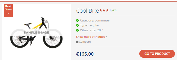 |
1.2 Add Complimentary Price Text
The "Price" settings in the "Appearance" tab, will let you add some additional information about the text.
| Turn on the "Show complementary text" slider to enable the feature. | 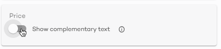 |
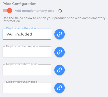
1.2.1 Add Simple Text to the Price
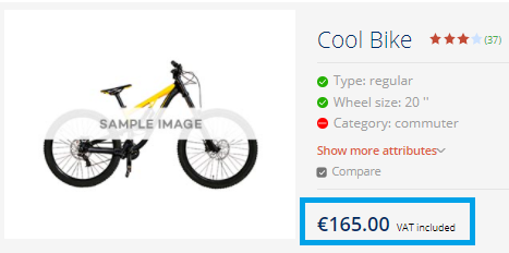
The simplest case is when you want to add some static text to all the prices. For example, "VAT included".
All you have to do is simply add the text in the field that fits the position where you want to keep the text. In the example, we'll add "VAT included" text after the price.
In the editor | In the Product Finder |
 |  |
1.2.2 Link a Property to the Price Complementary Text
Along with that, you can link complementary text to a product attribute.
For example, let's say that some of the products are limited offer, and the details of such offers are defined in a product attribute "limited offer" |  |
Click the link Icon by the complementary price text field and select this attribute. | 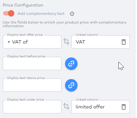 |
The data value will be added to the price.
1.2.3 Add a Property to the Price Complementary Text
You can also link an attribute value at the end of the complementary text.
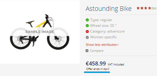
For example, let VAT be different for hybrid and regular bikes. In the Product collection, we've got a computed attribute VAT. Well define the text and add a link to the attribute.  | 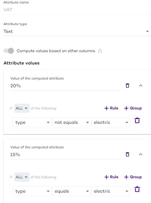 |
The different text will be added to different products.
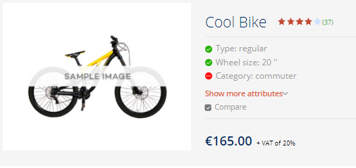
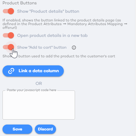
1.3 Add/Remove Product Buttons
By default, the product details button has the "Go to Product" text on it and is displayed. You can change the text with the "Edit standard texts" functionality.
The button redirects the visitor to the page specified as "offerurl" in the product collection or mapped to the offerurl for this Product Finder at the "Product attributes" settings.
| You can disable (and enable) it with the "Product details" slider in the "Product buttons" section of the "Appearance" tab. | 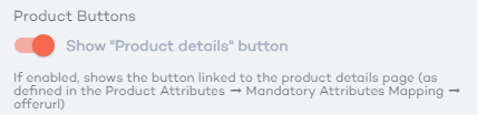 |
1.3.1 Add to Cart Button
By default, the add to cart button is not displayed. If displayed, it has the "Add to Cart" text on it that can be changed with the "Edit standard texts" functionality.
The button redirects the visitor to a URL specified as a value of a dedicated product attribute (that shall be available for the products) or to the product details webpage on your e-commerce site through the data file or custom JavaScript code.
You need to enable the button and add a link to the attribute or a custom JavaScript code. Here is an example of the final custom JavaScript code for add to cart button
|  |
2. Settings of the Product Attributes
Settings of the Product Attributes can be defined for all kinds of Product Finders.
You need to enable the button and add a link to the attribute or a custom JavaScript code. The following settings can be defined in the Design --> Product Attributes sections. There you can
| 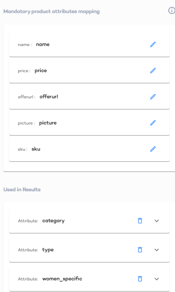 |
2.1. Map Mandatory Attributes
The mandatory attributes are:
name
price
offerurl
picture
sku
They are defined in the product collection. However, you might want to display other values of these fields.
For example, there is a name property: ID of the product in your product collection and a commercial_name with some fancy definition of the product. And you want values of the commercial_name to be displayed at the product tile.
To map the values:
1. Click the edit icon by the mandatory property in the "Mandatory products attributes mapping" section.
2. Select the property from the drop-down. 3. Click the "Apply" button 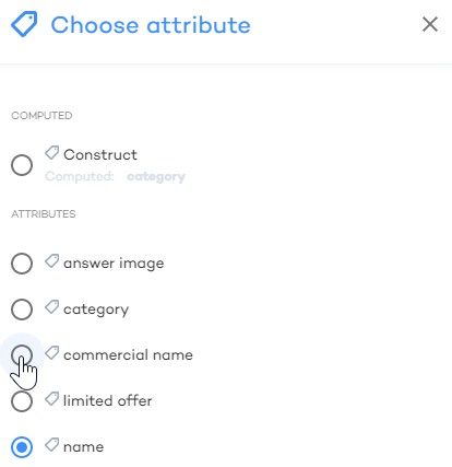 | 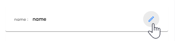 |
INFO
This change only affects values used within the Product Finder — changes will not be propagated to the Products tab.
2.2. Edit the Basic Set of Attributes for Recommendations and Alternatives
The settings available under the "Used in Results" header of the "Product attributes" section of the "Desing" tab cover the attributes displayed for all the products in the collection, recommended products, and top products.
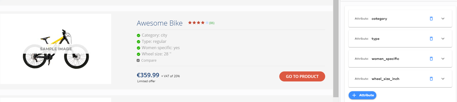
You can:
Add and delete attributes
Reorder the attributes
Change the way the attributes are displayed
2.2.1. Add and Delete Attributes
| 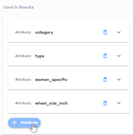 |
| 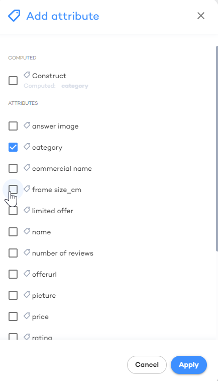 |
2.2.2 Reorder the Attributes
Drag and drop the attributes to change the order in which they are displayed.
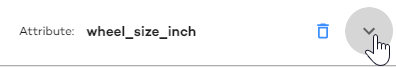
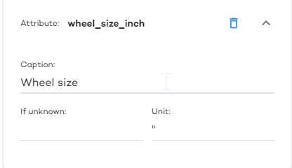
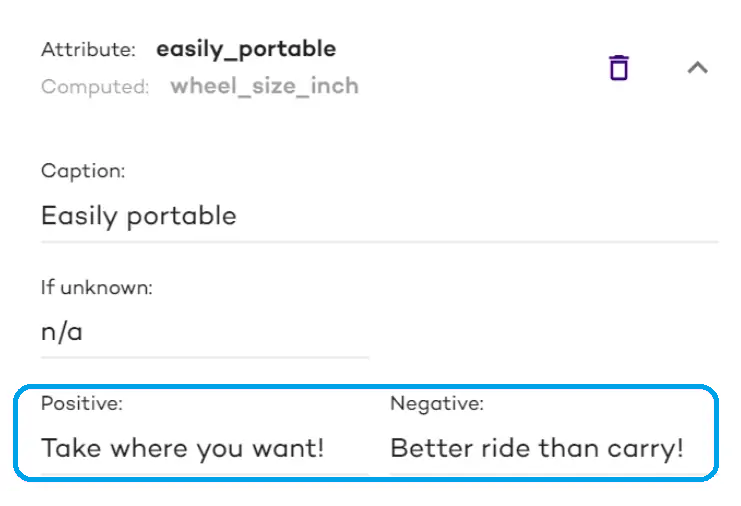
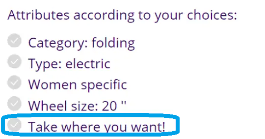
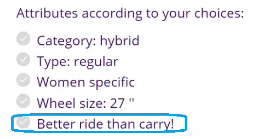
2.3 Change the Way Attributes Are Displayed
Names of the attributes in the product collection file may be rather technical. This is the tool with which you can make them more appealing and user-friendly.
|  |
How the attribute name will be displayed: click in the "Caption" field and define the value
What shall be written if the value isn't provided for a product: Click the "If unknown" and specify the text (if any), for example, "n/a"
Add a unit postfix: Click in the "Unit" field and enter any symbols that will be displayed after the value
| In the Editor | In the Product Finder |
 |  |
|  |
| In the Product Finder (True) | In the Product Finder (False) |
 |  |
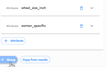
3. Edit the Compare View
When running the Product Finder, visitors can compare several products. You can redefine the view of the comparing tab with the settings available under the "Used in Compare" header of the "Product attributes" section of the "Desing" tab.
You can add and delete attributes, reorder attributes and change the way they are displayed in the same way as for the basic set of attributes.
However, you can also add groups of attributes to make it even more lucid.
 |  |
| 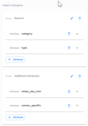 |
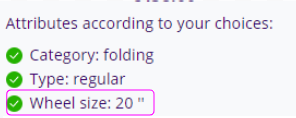
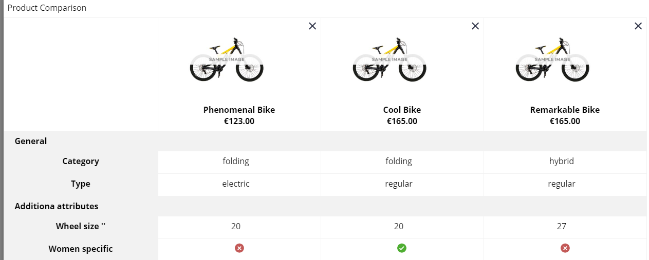
This is how the comparison from the example above will look in the Product Finder:
3.1 Copy From Results
You can also copy the basic set of attributes to the comparison. Then the compared products will have exactly the same attributes and captions there.
To do that, click the "Copy from results" button. This will remove all the previous settings of the comparison window and replace them with those of the basic property set.