Customize CSS of the Product Finder
Introduction
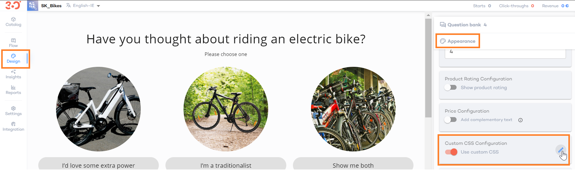
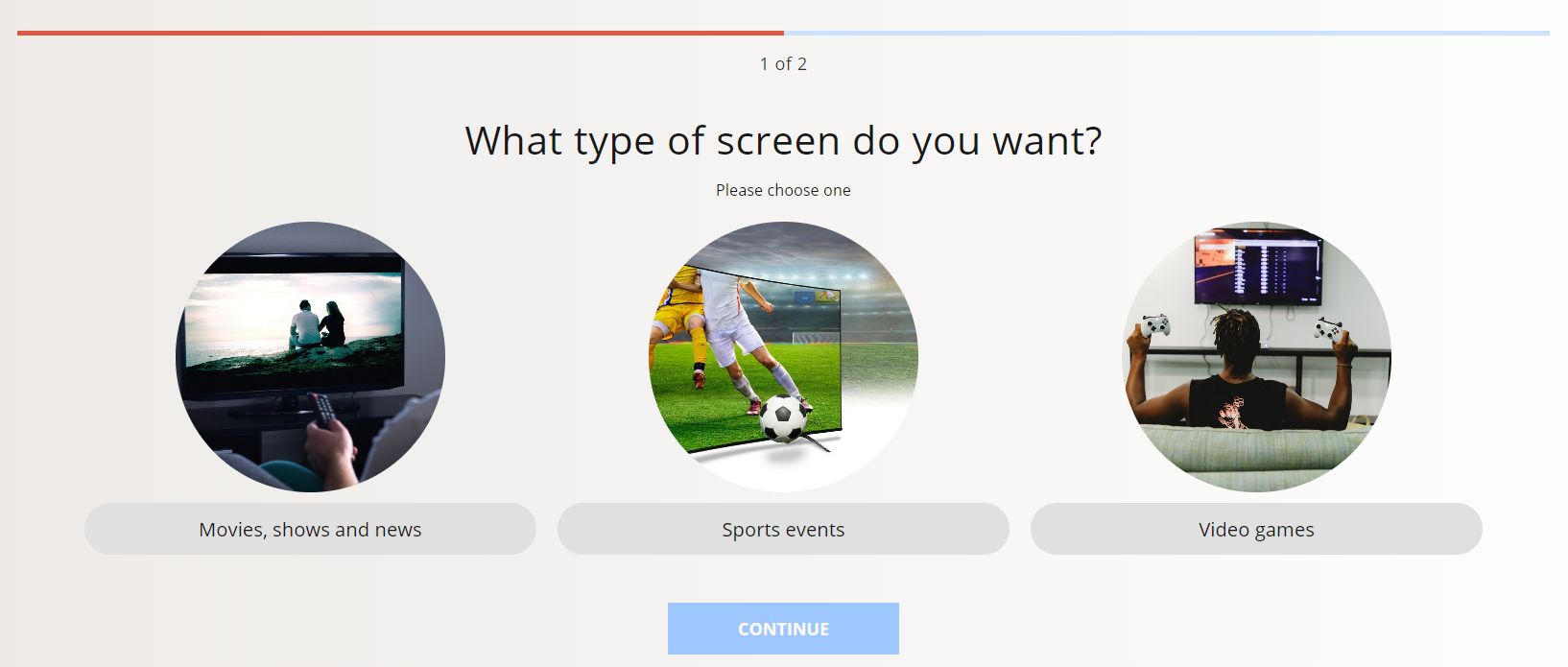
You can fully tailor your Product Finder’s design with the Custom CSS feature.To get to the settings, got to the "Design" tab, open the "Appearance" section and enable the "Custom CSS" option. You will find it in the Design tab, in the Appearance section.To start editing your custom CSS code, click the pencil icon. You will see a sample block of code, but that’s just a tiny portion of what you can achieve here.
From this article, you will learn how to:
TIP
Completely new to CSS? Check out these awesome resources to kick-start your styling journey!
1. Use the Sample Code
Once, you've clicked the edit icon, a piece of sample code will be displayed. You can update the code, according to your preferences. Remember to remove the comment signs ("/*" at the beginning and "*/" at the end) if you want to make the sample code work. | 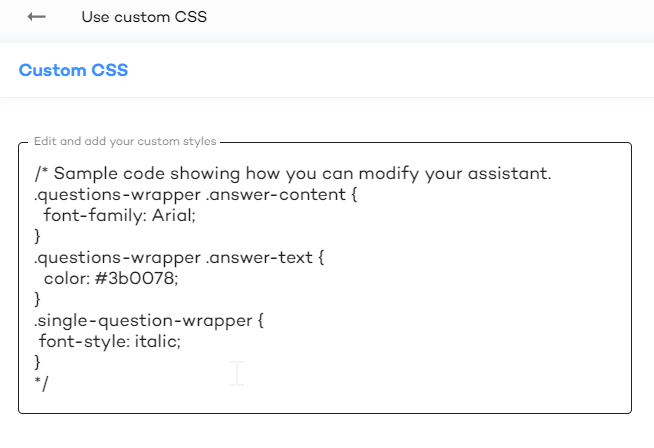 |
You can style any static class in your Product Finder, which are easy to recognize thanks to their user-friendly names, such as:
.top-navigation
.page-selector-wrapper
.questions-wrapper
.navigation-next-button
.product-details
WARNING
Avoid using .cXXXX classes, as they might break the performance of your Product Finder at some point. Use general classes, such as .answer-text to achieve your desired result.
2. Hide Neutral Attributes
In the Design/Product Attributes section of the Product Finder editor, you can select the list of attributes that are displayed in the recommendations of the products. However, you might select not to show the attributes that are not related to any of the questions answered by the customer. If so, use the following custom CSS code:.neutral-property {display: none;}
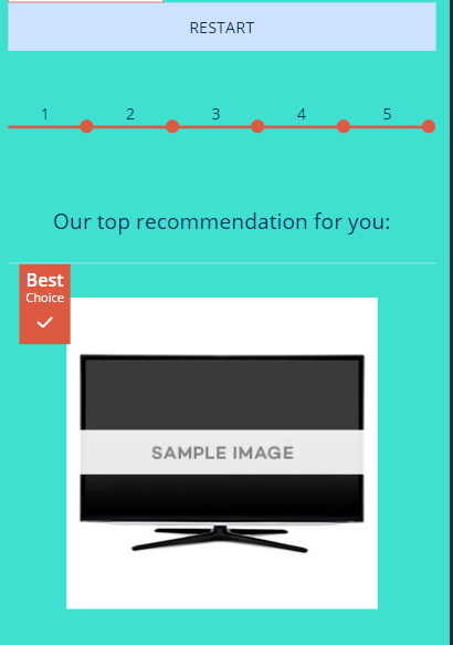
3. Change the Appearance of the Product Finder
In the following sections, you will find some examples, that show how you can change the following pattern
3.1 Change The Background Color
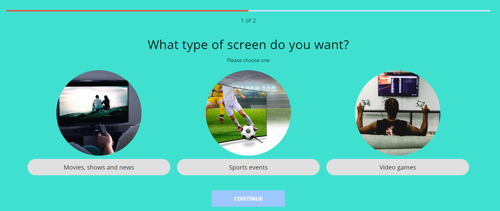
body {
/* fallback for old browsers */
background: turquoise;
/* code below for Chrome 10-25, Safari 5.1-6 */
background: turquoise;
/* W3C, IE 10+/ Edge, Firefox 16+, Chrome 26+, Opera 12+, Safari 7+ */
background: turquoise;
}
TIP
Want to easily select gradient for your Product Finder? Here’s an awesome resource that may help you choose your perfect color!
3.2 Change The Heading Color And Make It Bold

.questions-wrapper section p,
.questions-wrapper section .question-image p,
.questionnaire-wrapper .section-main-content .page-title,
.top-product a.product-name,
.top-product .properties-title,
.top-product .product-details .positive-property,
.top-product .product-details .negative-property,
.top-product .product-details .neutral-property,
.top-product .product-price{
 font-weight: 900;
 color: #fff;
}
TIP
Having problems picking colors? Use this color picker as a reference!
3.3 Center The Question Text
.answers-wrapper .answer-text {
  margin: 0 auto;
}
3.4 Make The Answer Corners Round
/*  ITEMS - Let's make them round */
.advice .product,
.answers-wrapper .answer,
.top-product .product-image a {
  border-radius: 20px;
  overflow: hidden;
}
3.5 Style The Buttons
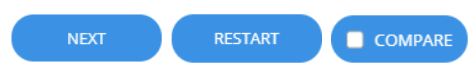
#app .start-over-button,
#app .navigation-back-button,
#app .navigation-next-button,
#app .navigation-back-button,
#app .navigation-next-button,
#app .product-compare-wrapper label,
#app .add-to-basket-button,
#app .page-button,
#app .page-button.selected,
#app .navigation-back-button,
#app .navigation-next-button,
#app .gap-button {
  border-radius: 20px;
  background-color: #3B92E4;
  border: 0px transparent;
  color: #fff;
}

#app .product-compare-wrapper label {
  background-color: #3B92E4;
}

/*  BUTTONS  - Let's add some hover effect */
#app .start-over-button:hover,
#app .navigation-back-button:hover,
#app .navigation-next-button:hover,
#app .navigation-back-button:hover,
#app .navigation-next-button:hover,
#app .product-compare-wrapper label:hover,
#app .add-to-basket-button:hover,
#app .page-button:hover,
#app .page-button.selected:hover,
#app .navigation-back-button:hover,
#app .navigation-next-button:hover,
#app .gap-button:hover {
  background-color: #3B92E4;
  text-decoration: underline;
  transition: all .2s ease;
}
3.6 Change The Question’s Overlay On Hover

/*  IMAGE OVERLAY - Let's make it green on hover*/
.answers-wrapper .has-image .answer-content:hover {
  background: linear-gradient(transparent 0%,transparent 50%,#EC6EAD 95%);
  transition: background ease .5s .8s;
}
3.7 Create the Hover Effect
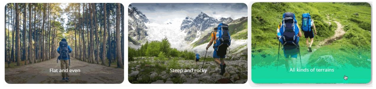
/*  ITEMS - Let's add hover effect */
.advice .product:hover,
.questions-wrapper .answers-wrapper .answer:hover {
  transform: translateY(-2px);
  transition: all .3s ease;
}

/* ANSWER IMAGE ANIMATION  */
.answer:hover .image-element {
  transform: rotate(-6deg) scale(1.3);
  transition: all 1s ease;
}
4. Adjust Appearance For Mobile Devices
With our CSS Editor, you can specify CSS rules that apply only to specified conditions. For example, you might decide to switch the appearance of the restart button when the Product Finder is displayed on a mobile device.
/* Let's specify the media query saying that the rule within will apply
for screens with maximum width of 768 px */
@media screen and (max-width: 768px) {
.start-over-button {
width:100% ;
margin: auto ;
}
}
The code above will stretch the restart button to use the full width of the screen.
More?
With CSS, the possibilities are endless! Feel free to grab our CSS Handbook file to create something beautiful.
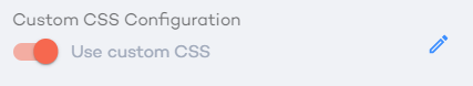
5. Finalize the Changes
You will be able to see your changes in the Product Finder only when Custom CSS is enabled. Simply switch the toggle on:
TIP
When your changes don’t apply in the Product Finder, try using the "!important" rule. This will override any class relationships that might be blocking your customization. For example:
.questions-wrapper .answer-text {color: #3b0078 !important;}
TIP
Don’t know how to open a .css file? Still having problems with editing your CSS? Let us know at help@Product Finder 360.com, we are more than happy to help!