Integration Best Practices
Introduction
The success of your Digital Product Finder depends on how well you integrate it into your website and how visible you make it to your users!
The optimal integration of the Product Finder leads to multiple benefits for both your business and your customers.
For Your Business:
Unique and consistent brand experience across all touchpoints
More visits to the Product Finder ⇒ increased sales opportunities
Up-selling possibilities
Fewer customer support requests
Higher user engagement
For Your Customer:
Increased consumer confidence and satisfaction
Suitable products found faster
Accelerated purchase decision-making
Enhanced user experience
Drive Customers To Your Digital Product Finder
It's crucial to use correct entry points that clearly let your customers understand what they are about to do. What’s important is a clear call to action, differing it from standard ad banners.
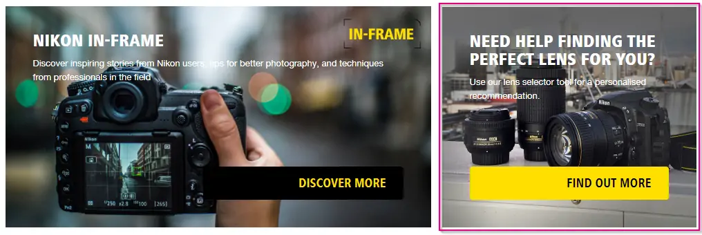
You can even create a banner that contains a question from the Product Finder

If you are using some kind of a banner, it's better to keep the whole banner surface clickable, not only the start button.
Have Multiple Entry Points to Your Digital Product Finder
As we've described in the article on the creation of entry points, it's better to have several entry points to make sure that all the customers in need of help with their choice will actually get to the Product Finder.
Word Your Call-to-Action Properly
While great entry paths are crucial for the success of your Digital Product Finder, creating an engaging call-to-action button is just as important. Below, you can find some of our tips on how to phrase your CTA and what to avoid.
Do’s
Your CTA should be as transparent as possible. It should instantly tell a user what to expect when clicking it:
Find your perfect wine
Laptop Finder
Don’ts
Your CTA is ambiguous and does not imply the user’s destination after clicking it:
Learn more
To the guide
When it is clear to the visitor where they will be taken by the link/button, they will be more eager to enter and will engage with the Product Finder to a higher degree. This will result in a larger number of interactions and an increase in sales opportunities, thus generating more revenue for your business.
Do’s
Using questions in your CTAs is a nice way to intrigue and make the user want to enter your Product Finder.
What’s your style?
Which bike is perfect for you?
Don’ts
Do not use questions that suggest entering your customer support or FAQ section.
Need help?
Want to know more?
Do’s
Your CTA should be consistent with the rest of the tone of your website. If your style is more easy-going, try to formulate the CTA in a similar way to make it fit in as a part of your website.
Don’ts
Having a detached CTA wording that doesn’t match the rest of your website will make it seem external and not an immersive experience within your website. If the language on your website is more formal, your CTA should follow this trend.